

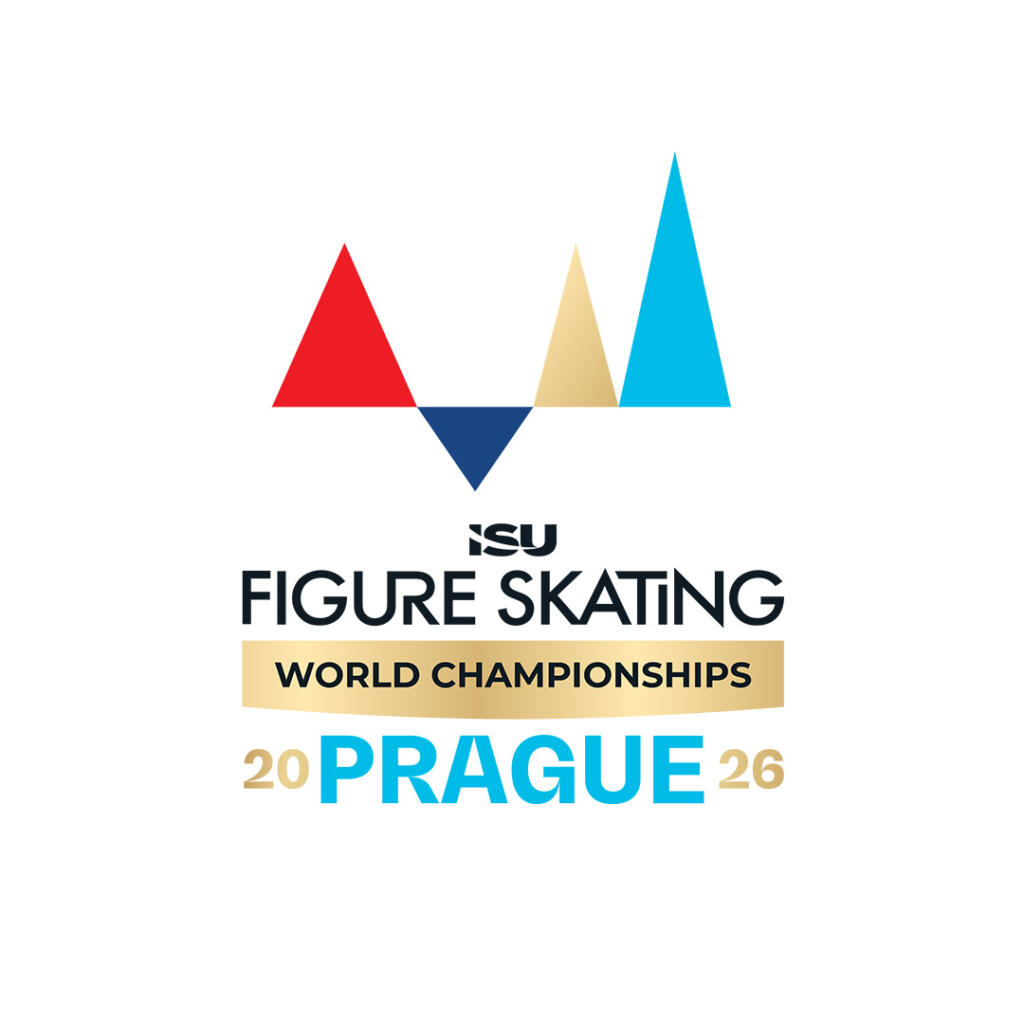
Seven months ahead of the ISU Figure Skating World Championships Prague 2026, the Organizing Committee has introduced a significant visual change. A new logo has been unveiled, aligned with the recently updated corporate brand identity of the International Skating Union (ISU). The design is based on a modernized and unified template that the ISU plans to apply across all disciplines and competitions. A similar approach has already been successfully adopted by the International Ice Hockey Federation, for example.
From now on, all ISU competition logos will share the same core graphic elements, while details can be customized by local organizers to reflect the character of the host country, city, and the competition itself. “Adapting our original logo to the new international visual standard was a challenging task, as our initial design differed significantly from the ISU brand identity concept. However, we worked closely with the International Skating Union to find a compromise in the spirit of friendly cooperation. In the end, we succeeded in creating a solution that maintains the identity of the Prague championships while meeting the new requirements,” said Miloš Židík, Head of Media Operations, Communications & Brand Management.
One of the most striking features of the new logo is the use of gold, symbolizing victory. This element will serve as a unifying motif across all ISU event logos. “Gold represents success and peak performance, and we hope that this is exactly what the Prague championships will embody,” Židík added.
Starting today, the new logo will appear on all materials related to the ISU Figure Skating World Championships Prague 2026 – from promotional merchandise and digital communications to venue branding during the championships.


